
Request a Consultation
Ready to upgrade your digital marketing systems but unsure where to start? Complete this form to request a preliminary evaluation of your current systems. We will reach out to schedule an introductory meeting.

Web design is similar to fashion in that design choices and styles go through periods of popularity. For example, a few years ago, when Apple came out with iOS 7, thin and crisp typography was all the rage for a few years. Now, big and bold typography rules the day. The question becomes, what styles are a fleeting fad, and which ones will have more staying power? When you are investing in a site redesign, you want it to have as much staying power and design durability as possible so that you aren’t going back to the drawing board after just a year.
What follows are the current trends in web design along with JCM’s best guess as to the longevity of the trend.
 I can see this one lasting a while, at least until it becomes so overused that it no longer serves as an eye catcher. For my personal aesthetic, I like thin fonts, but large, in-your-face typesetting is certainly a way to draw attention either to a brand message or a call to action. Just please, please, place that type against a background that supports it. And don’t use drop shadows on text as a crutch. The design has to call for it.
Estimated staying power: 5+ years
Difficulty to update: Low

I am coming around to this trend, which arguably also started with Apple and its gradient backgrounds on App icons. A couple years ago, during an initial design review, one of our clients asked if we could make the header of the website “more frosty” (looking at you, Doug!) That has turned into an inside joke, but what he was driving at was to make the header background a gradient instead of a solid color. This went against design conventions at the time, but he must have had some foresight. *Update March 6th, 2018 – A new logo design brought a new header design request, and the gradient went away.*
Gradient and “3D” style designs will always wax and wane vs. flat designs in about a 2-3 year period. Gradients and bright colors can become taxing on the eyes over time. I expect a return to solid, muted colors, maybe even pastels, within a couple years.
Estimated staying power: 2 years
Difficulty to update: Medium
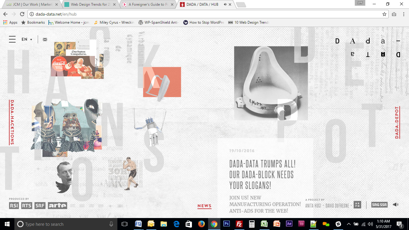
The perfectionist, OCD side of me wants this trend to die as soon as possible, but I predict I won’t. Luckily, it won’t ever become mainstream either. This trend has to do with breaking out of the norms of uniform design, throwing things off balance. It works in a very limited capacity for a very limited number of brands… those that want to be seen as “edgy” and “disrupters.” It reminds me a bit of the trend in typography in the 80’s and 90’s towards graffiti and comic book inspired design, rather than the cool, clean lines of Helvetica and its brothers, sisters, and cousins. BTW, nothing trumps Helvetica, ever.
Estimated staying power: 5 years (but will stay on the fringe)
Difficulty to update: High

I can’t stand this one. Just cause you can doesn’t mean you should. With new tools in HTML5, CSS3, and more, animations are easier to integrate than ever. And web developers are over-doing it like crazy. Animation should be used for one purpose only – to attract attention and drive an action. Viewers are going to get sick of overly-animated content very quickly. Thankfully, I believe this trend will die very soon.
Estimated staying power: 1 years
Difficulty to update: low
Haha, I’m trolling a little bit here with that photo. Sorry, I have a weird love for irony.
Instagram and selfie culture has been the nexus of this current trend. Now that everyone has a high definition camera in their pocket, the need for stock photography assets has declined. Users are more interested in genuine, transparent content than ever. It’s actually better these days to not use photography at all than to use stock photography. And if you don’t have the ability to produce actual image assets, photography sites such as Flickr have options for searching the open source tagged photos. These types of photos have a much more “real” feeling than the typical stock photography. It takes a little longer to wade through the content, but the results are worth it.
Estimated staying power: probably forever
Difficulty to update: medium
…and most other CRMs that allow you to create custom fields. Request a consultation below to discuss your CRM needs.
…and most custom forms that allow hidden fields and don’t utilize cross-domain iFrames. Request a consultation below to discuss your contact form needs.
Ready to upgrade your digital marketing systems but unsure where to start? Complete this form to request a preliminary evaluation of your current systems. We will reach out to schedule an introductory meeting.
Our first step is a 30-minute digital marketing consultation to explore whether we’re a good match and create a customized plan of action.