
Request a Consultation
Ready to upgrade your digital marketing systems but unsure where to start? Complete this form to request a preliminary evaluation of your current systems. We will reach out to schedule an introductory meeting.

One of the most important aspects of marketing is a business logo. You can create a catchy phrase, but nothing sticks in someone’s mind like a creative picture surrounding the company name. And my favorite part? A logo with meaning. Anyone can put an interesting design on their website, but the true artists of advertisement are the creatives that really think about how their logo is going to impact the brand and its customers.
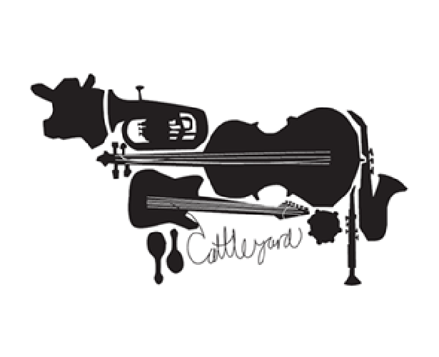
Cattleyard Promotions of Australia endorses music both internationally and locally. Their logo cleverly depicts the side profile of a cow in the form of musical instruments. Even better is their slogan: “Cattleyard Promotions. The stable at Cattleyard are dedicated to promoting and touring the finest cuts of Australian and International music.”
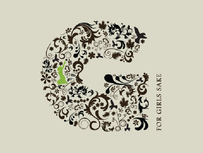
This concept hits right at home. For Girls Sake is a grassroots company, also known as a company with political motivation, that raises money for girls in third world countries. They provide everything from books and scholarships to living expenses. The logo is both beautiful and symbolic.
Love clip is a stationary brand. Their logo is both elegant and feminine with a hint of intuition toward the product. Its simplicity is appealing and artistic.
This logo is just impossible to hate. It features an adorable piece of sushi wearing a Napolean-style hat.
This all-too-literal logo completely misses the mark on aesthetic appeal. Its font is neither catch nor appealing, and the images leave much to be desired. How about trying something that isn’t so obvious, Tree Doctor?
Bee’s Kitchen uses a bright color to catch the eye, with a minimal font and small, but creative image to bring forth a bold and memorable logo. What’s not to love?
At first glance, the pink numbers look like random blocks of color. However, upon closer inspection, we can tell that they are actually meant to represens “2012.” This one really missed the mark for obvious reasons: undecipherable, messy, and nursery colors. All of which combine to create a sub-par logo seen by millions.
This logo for Killed Productions is simple, but not overly simplistic. It also has a bit of humor, which appeals to customers, and a basic color scheme.
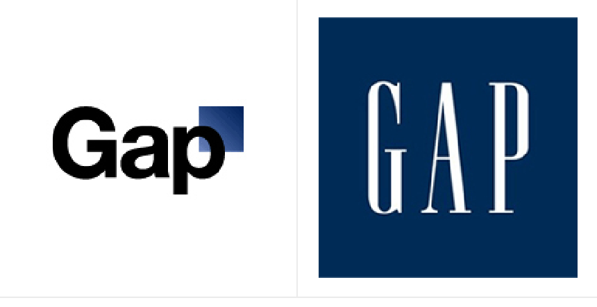
The logo on the right is the ever famous Gap logo. On the left, is the failed logo established in 2011. Because of such popular brand recognition, Gap failed to reach out to their established customer base when changing the logo without any sort of warning. If you ask me, the logo on the left looks like anything but a clothing brand logo.
…and most other CRMs that allow you to create custom fields. Request a consultation below to discuss your CRM needs.
…and most custom forms that allow hidden fields and don’t utilize cross-domain iFrames. Request a consultation below to discuss your contact form needs.
Ready to upgrade your digital marketing systems but unsure where to start? Complete this form to request a preliminary evaluation of your current systems. We will reach out to schedule an introductory meeting.
Our first step is a 30-minute digital marketing consultation to explore whether we’re a good match and create a customized plan of action.